02
Lumina Website Case Study
- Role Lead UI/UX Designer
- Tools Figma · WordPress · Elementor
- Live site dulcet-kitsune-05d380.netlify.app
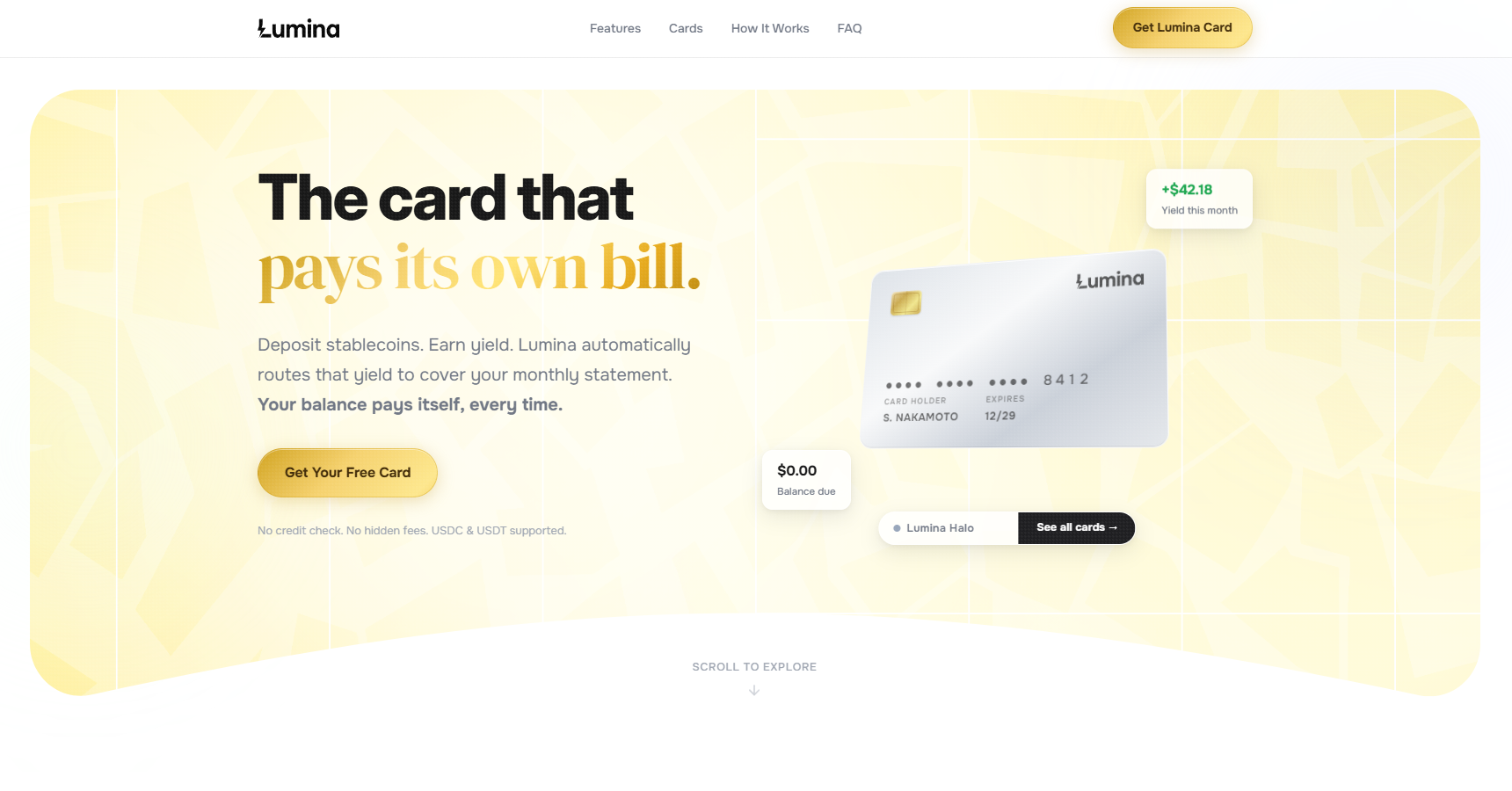
The Concept
Lumina was conceptualized to bridge the gap between decentralized finance and everyday usability. The primary goal was to design an ecosystem, spanning both a marketing site and a mobile app, that strips away the intimidating complexity of crypto. By translating intricate yield-generation protocols into a clean, premium interface, the project proves that a crypto-backed credit card can feel as effortless and trustworthy as traditional banking.
From the initial brand identity to a fully responsive web build and a high-fidelity mobile prototype, the process focused heavily on transparency and ease of use. The experience is driven by a clear data visualization strategy, allowing users to effortlessly track their stablecoin yields and card balances. Every touchpoint was designed to ensure that managing decentralized assets feels secure, seamless, and deeply integrated into a modern financial lifestyle.
Feature Walkthrough Carousel
A horizontal scroll that breaks down the app's core mechanics, pairing simple explanations with real UI snippets.
Component-Driven Design
Every element of the Lumina interface starts from a single source of truth: a token-based system with a strict color palette, typography scale, and a component library built for consistency and scalability.
A light, airy surface contrasted with Lumina Gold accents that direct attention toward key actions and financial data.
Inter (700–800) drives the headlines with tight tracking, while Onest (300–500) handles all body and label copy for a clean, readable flow.
Semantic color signals reinforce financial clarity: green for yields, indigo for focus states. An 8-point grid keeps everything aligned.
#16A34A
#6366F1
Cards
Pills
Sequential Setup Reveal
The three onboarding steps fade in dynamically on scroll, guiding the user through a zero-friction setup process.