The Concept
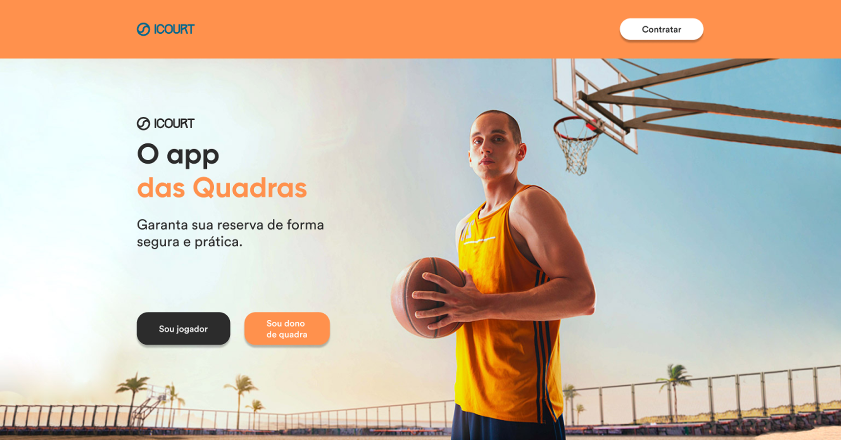
iCourt was conceptualized to revolutionize how people engage with local sports facilities. Designed as a dual-sided marketplace, the platform connects sports enthusiasts looking for quick court reservations with facility owners needing robust business management tools.
By leveraging an energetic color palette anchored in a vibrant sports orange and deep charcoal contrasts, the visual identity communicates action, reliability, and community. The project focused on creating a high-converting landing page structured around two clear, parallel user journeys all designed in Figma with strict auto-layout rules and a card-based architecture.
Two journeys. One seamless product.
The layout seamlessly segments the experience into features for players and tools for court owners, using full-width color blocks to subconsciously separate each journey without requiring extra navigation. Every section was built with component-ready auto-layout to ensure a visually engaging narrative that drives app downloads.
For Players
- Easy court scheduling
- Secure in-app payments
- Location-based discovery
- Real-time availability
For Court Owners
- Schedule management
- Data analytics
- Revenue tracking
- Booking automation
High-Energy Visual Identity
Every visual decision in iCourt is governed by a single principle: communicate action and trust simultaneously. The token system uses iCourt Orange as the sole brand driver, anchored by deep charcoal surfaces and clean white sections.
iCourt Orange drives all CTAs and owner-focused sections to stimulate action, while charcoal surfaces create dramatic contrast for player features.
Gilroy for bold, geometric headlines and Circular for highly scannable body text. Weights from Regular to Bold create a tight hierarchy where every level signals its own importance.
Card-based UI with uniformly rounded corners and full-width color blocks for visual segmentation. 8-point grid ensures consistent rhythm across all sections.
#FF914D
#2C2C2C
Cards
Pills